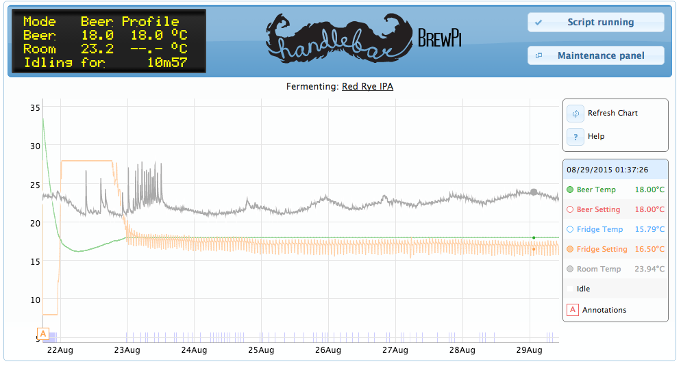
I rearranged some of the php code in the /var/www/beer-panel.php file to make room for my own brewery’s logo. I had to move the currently fermenting title line down into the beer-chart row, and resize the chart slightly. The logo size that I used was 300 x 75 pixels, but it can accomodate larger.
I wanted to hit on this post for a minute due to the nature of the title which is discussing the web interface. I know with the new code being developed for MASH/BOIL/etc, I am wondering what the web interface is going to look like. I see a lot of talk on the code being developed but nothing in the web interface. I don’t like to compare controllers due to how each one provides its strengths and weaknesses, but I would like to talk about how the BrewTrollers web interface looks. After reading on some forms and information from the person that took over BrewTroller, the web interface seams to be spot on in how it functions and it provides the user with the easy to use GUI such as gauges that show temps. I had put in a post that the brewPi is a “little box that packs a big punch” and I am looking forward to when it is fully complete but @Elco can you give some details on how the web interface is going to look and what changes can we see to come if any?
Looks like your beer-chart and beer-chart-controls are both too tall for the beer-panel. This I assume is due to the size of your brewery logo. Note that I tuned mine to fit in the current space. Also as a note it looks like you added your logo, while I replaced the pre-existing logo.png file in /var/www/
Find your way to /var/www/css/style.css and change the height of beer-panel until is looks good on your web interface.
If you are as new as me to Linux, I’d be happy to walk you through how to do that.
Since the last post I’ve been tweaking it. I reduced the image size, and adjusted the chart height to 325 px. It looks pretty good now.
I also replaced the existing logo.png I wanted to keep the original brewpi logo along with mine. So I combined them in GIMP, then replaced the old logo with it.
Now if I can figure out why my annotations are repeating that would be great.
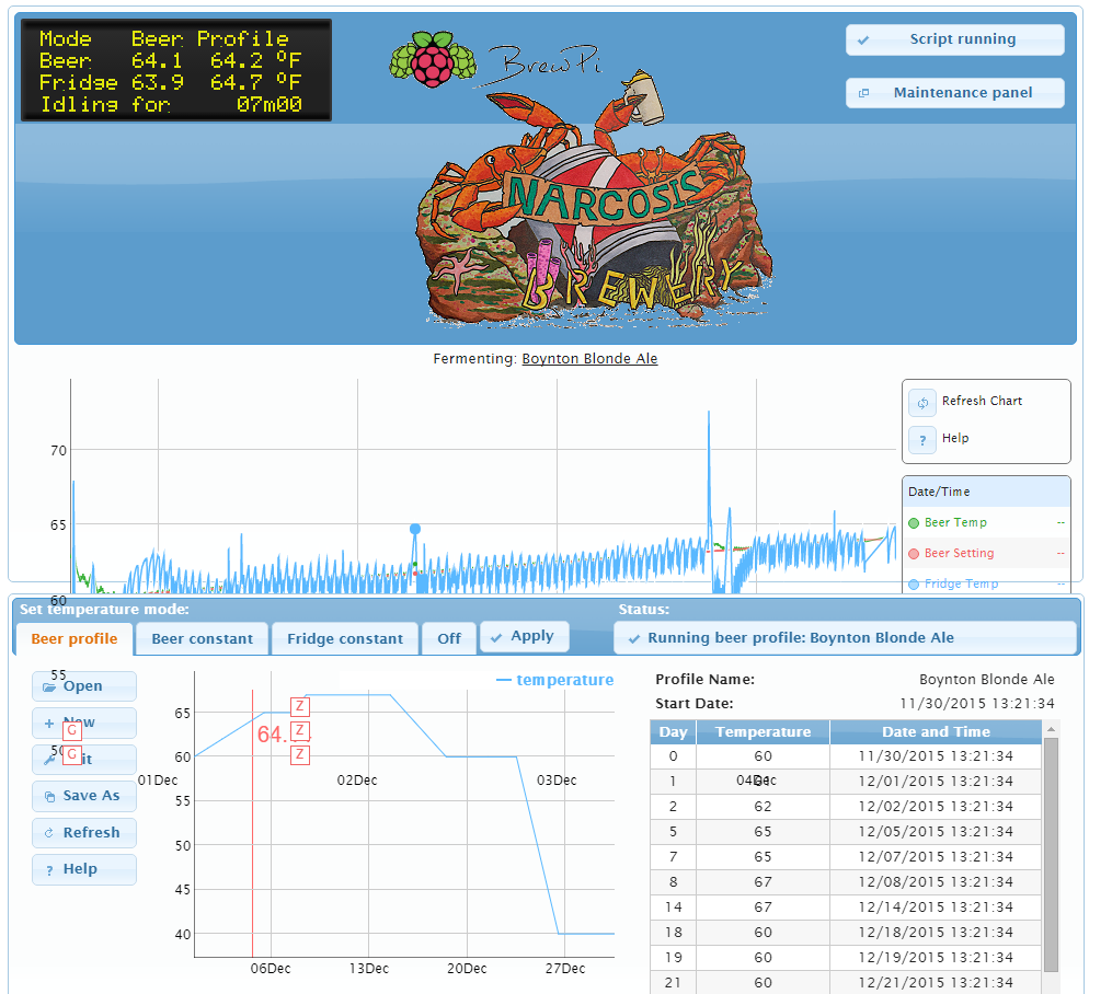
@Ron_K, You need to take the default logo out. This is one of the reason why it looks like that. Just replace it with your logo file name. Also make sure that your logo size is not too big due to this happing. You will have to play around with it but once its done it will look good. I will post a pic of mine soon so you can see what I mean.