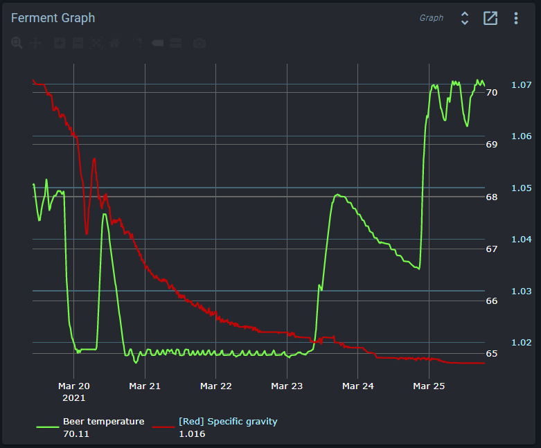
Anyone come across this issue? The Sg numbers on the right axis are cut-off.
And ignore the temp plot. I was messing around with the controls…
I think that’s working as intended. I don’t think there’s a setting to specify the number of decimal points for the axis. It just shows enough decimal points to make sense of the grid lines its chosen. Just like how the temp has more resolution that 1degree but it only shows that because any more would be redundant. And how homebrew hydrometers got to +/-0.002 SG but commercial ones often go to +/-0.0005 
Also worth noting that those axis are just a number with no unit. You can stick anything on the same axis as the SG and it’ll adjust to accommodate the range of values required.
Let’s try this again.
I can measure, very easily, with an sg tools measurement of 1.042 - as an example.
But in the Brewblox graph it will only show 1.04
And there is a big difference between 1.010 and 1.012. So that third digit is very important to any serious brewer.
So how do we configure the graph to show that third digit?
Thanks
Bob
If you move over the graph with your mouse you can get the exact value.
For each graph key selected you can set the precision for display.
But I agree we could see if we could set the axis precision to the maximum precision of the data it represents.
Axis indicators are distributed evenly throughout the range of shown data. Additional precision would merely add trailing 0’s.
There’s also the Tilt widget available these days which will give you the most recent readings at full precision
Hovering works fine. Just was thinking that Third digit is pretty typical in brewing.
Thanks for all the replies and thoughts.
True, it’s just that you don’t think of specific gravity as 1.02 when brewing, you’d still stay 1.020.