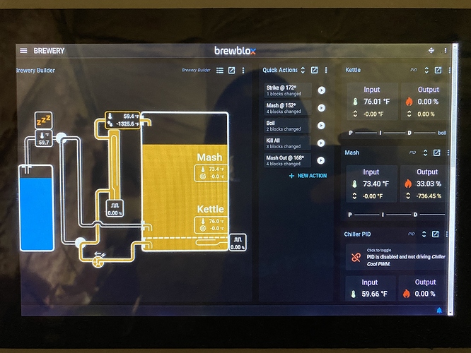
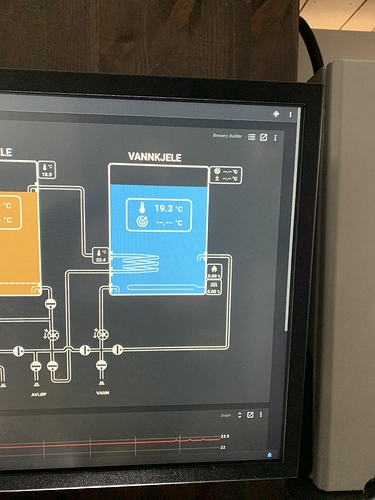
OK so I have been trying all sorts of stuff to try and hide the scroll bar in kiosk mode cause it straight drives me nuts!!! in the end I have determined it 100% has to be changed in the website code. I started inspecting and looking for the overflow-x overflow-y so I can change x and y to hidden. buttttt I was hoping you could point me there faster or maybe have some other fix…
I did some digging, and the scroll bar is visible due to a css selector of:
.grid-main-container, .grid-container-overlay {
  padding-bottom: 50%;
}
I tweaked it a bit, and it will now correctly hide the scroll bar if dashboard content fits on the page. (You’ll see changes next release)
I can’t even begin to explain in words how amazing you guys are. Coming from cbpi to this is the single best investment I have made in brewing beer!!!
So I did the update and it didn’t get rid of the scroll bar. Maybe u could point me to the right file. I could mess with it. Might be something specific to my setup. All though I had the exact same issue with CBPI 3.1. I had to make some adjustments to that one as well. But that one was because the dashboard block was overshooting.
I do notice that the block on the left of the dash board is cut off. I’ll upload a photo when I get home.
That looks like it triggered the scroll bar by just a handful of pixels. You can try zooming out one tick - the scrollbar should then disappear.
Trickier (but not impossible) would be to re-arrange your dashboard to take up one less row.
I’ll look into the cutoff on the left and right tomorrow. It may have something to do with re-rendering after the sidebar is hidden.
ok so I created a new dashboard and there was no scroll bar. as soon as I added one widget. it made the scroll bar even if the widget was in the middle of the screen!
That is weird. I just checked on FF / Chrome / Edge here, and the scrollbar properly disappears when not in editor mode. I did spot a bug in positioning of pickup when moving widgets.
If you inspect elements and look for a div with classes grid-container grid-main-container, how big is it? (it’s a background div for the dashboard)
I can’t get to inspector on my kiosk. What file would I find that in?
Or would my Mac show the exact same?
In source code it’s part of https://github.com/BrewBlox/brewblox-ui/blob/develop/src/components/grid/GridContainer.vue.
Your Mac may show the same, but it probably depends on screen size.
I can’t seem to navigate to that in my Brewblox directory.
You won’t be able to access it like that when it’s packaged for production. During the build, all html/js/css is optimized into unreadable gibberish.
Does the issue also reproduce on your Mac?
Ahhhhhhh ok. I’m going to load this on to a normal version of buster. And use the inspector. Need to get to the bottom of this nhahaha
I solved this by installing this scrollbar extension on chronium! Looks much better https://chrome.google.com/webstore/detail/modern-scrollbar/bgfofngpplpmpijncjegfdgilpgamhdk
Bob!!!
great job with the new update. fixed the majority of the scroll bar issue except the bottom block of the movement grid. still throws the pesky scroll bar on the side. so I can’t use the whole bottom row of organization. obviously this is critical but we all seem like were in the pursuit of perfection so that’s why I bring it up!!!
Happy to hear it works better now!
Exact trigger points for scroll will vary based on screen size/resolution. I may have a look at adding a fitted/normal toggle to dashboards, but this depends on whether we can do so without having to adjust a bunch of widgets.
For an example, see the relations diagram on the spark page. This already can toggle like that.
I wounded if I turn off over scan or one of those options. On the pi itself.
Scroll bars are handled by your browser, not the native window manager. I’m not aware of settings in chrome (or any other browser) to handle this. Overflow (scroll) handling is a CSS property, and should be adjusted in source code.

