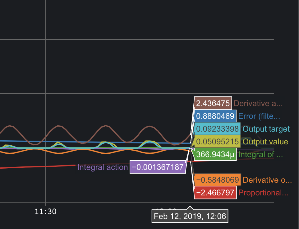
I’m looking at the graph of PID on my new system with BrewBlox, which by the way is happily fermenting beer right now, and wondering what these all mean:
The system only has a chiller right now, the system is slowly warming to it’s set point, so I can see proportional becoming less negative over time, but still -1.8ish, but what is the unit of these numbers? When does it actually trigger the chiller to engage, what setpoint is that, and what unit is it in?
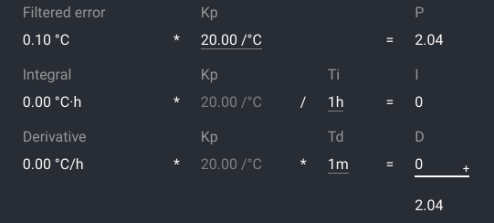
I think there is a bug somewhere that causes units to not show. They are the same as in the settings form:
If you couple it with a PWM actuator, the output unit is % active, with 100% being on continuously.
So the error is (setpoint - actual temp) after filtering.
Derivative of error is in degrees per hour.
Integral is in degrees multiplied by hours.
The settings from also shows how there are multiplied or divided with Kp, Ti and Td to get the output parts P I and D.
In your case, the derivative seems to be a bit overactive. Maybe because you have not updated to the latest version (we had a bug in derivative filtering).
way better! Will upgrading my firmware dump my current brew’s data?
If you’re upgrading the display, I added one issue in GitHub, that duration/close modal is in exactly the wrong place for every graph, it’s always covering what just happened. I open devtools and hide it every time I look at the graphs. if that could go off the graphed area, that would be awesome.
I’ll probably dig into this tonight, but I’d like to be able to display ad-hoc influx queries, or just graph multiple widgets (with their respective scale) on the same graph. I’m not a front end engineer, so don’t expect anything special from me, but I’ll try to chop something together for this.
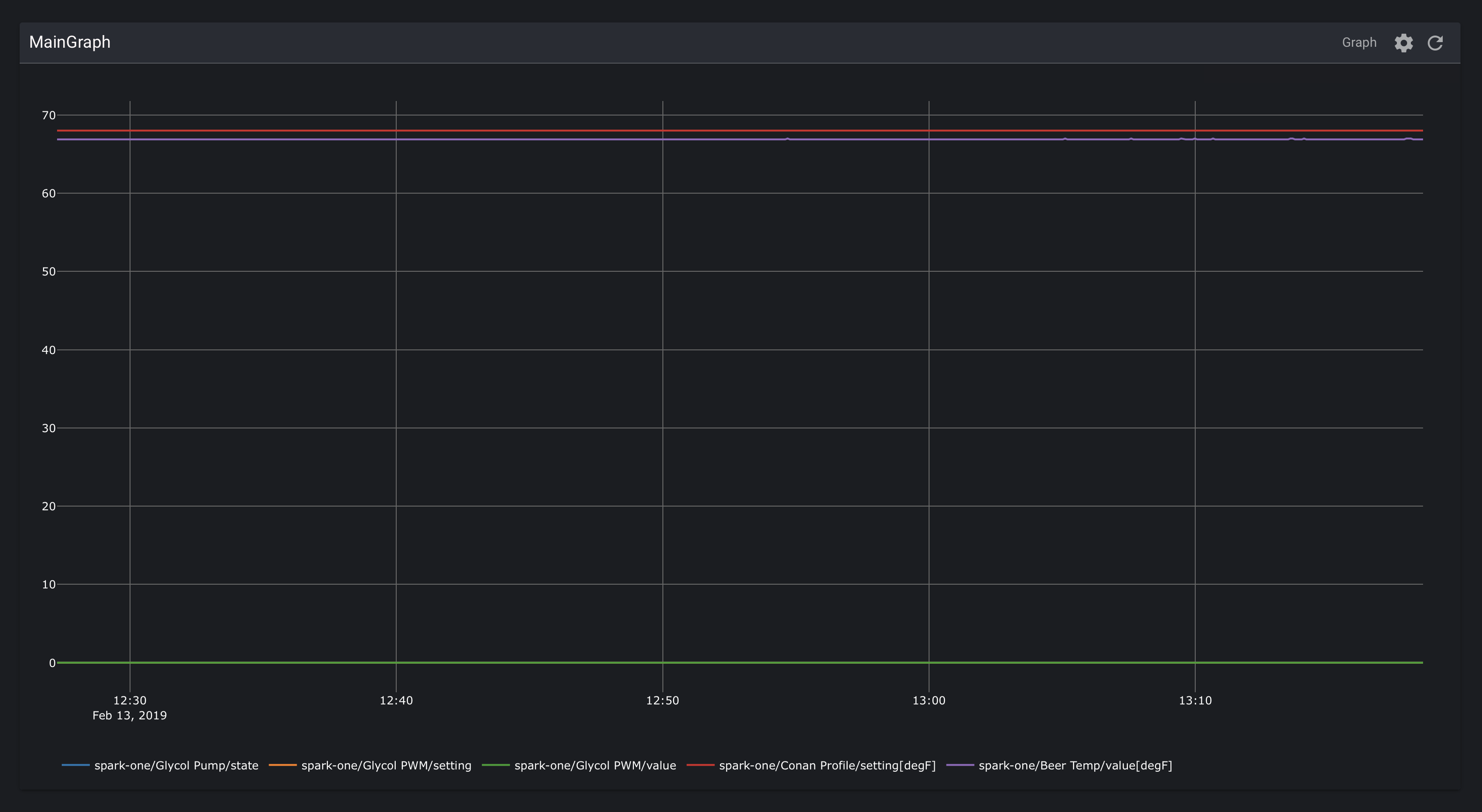
maybe this is less of an issue when you read temp in C, but for me the scale for a lot of process is 0-1 or less than 10, but my temp is 68 so the graph gets difficult to resolve. I’d like to be able to run 2 independent scales on a single graph, one on the right and one on the left.
Graph widget(s) can be used for more persistent data grouping. In individual graphs you can also show/hide lines by clicking on them in the legend. Double click to only show the clicked line.
I don’t think there’s a screen position where the settings area in a fullscreen graph will never cover data, and still remain findable. A viable solution may be to make it draggable.
For now, you can also work around it by dragging the plotly graph so “now” is to the left of the settings (shift+drag I think).
Hi Bob,
This is what I’m talking about, if these two graphs were overlaid with one scale on the left Y axis for temp, and one scale on the right axis for the PID loop and pump state, you’d be able to see the actual data, instead of a straight line for everything, because the scale on the left would be something like 65-70 deg F and the scale on the right would be 0-1, so I could quickly see that turning the pump on for X seconds results in a corresponding drop in Y deg over Z hours:
If you click on a value in the legend (below the X axis), it will hide that value, and automatically rescale the Y axis range. You can also click and drag inside the graph to zoom in.
Plotly (the graphing library) does support multiple Y axes, to achieve the effect you describe. This (and some other layout options) is something we’d like to support in the future, but does not have top priority.